
Despite the well-known saying “you can’t judge a book by its cover,” readers often shop with their eyes. Humans seem to be wired this way. “More than 50 percent of the cortex, the surface of the brain, is devoted to processing visual information,” points out Williams, the William G. Allyn Professor of Medical Optics.
So, covers should be eye-catching, and consistent with a book’s promise and/or genre. That is, they should deliver “break-through” and “convey meaning.” In my previous article, “Five ways to ‘SPARC’ Great Design,” I share these principles of book cover design:
- Simplicity breaks through, so don’t try to stuff everything onto the cover. Rather, focus!
- Prioritize your communications hierarchy.
- Assess designs against the brief, not personal taste
- Real-life: assess design in situ
- Consistency, consistency, consistency
In case you missed that piece, here’s a link https://diymfa.com/community/book-cover-design.
Today, let’s take a look at some book cover trends from 2021. These covers are mainly sourced from “the best of 2021” lists, compiled by Kirkus, Goodreads, and other industry sources. The below designs illustrate trends, but can certainly be grouped in different ways. Note that this list isn’t meant to be exhaustive or used prescriptively.
With those caveats in mind, see if you’ve noticed any of these book cover trends:
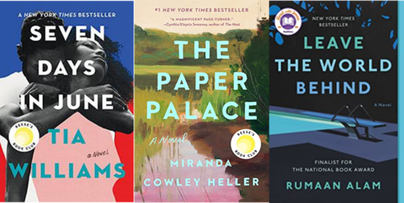
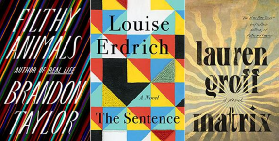
1. Simple, yet Evocative
As digital book sales and ads continue to grow, there’s been a long-term trend towards simplicity to break through. This helps designs register at a glance or as a small thumbnail image. The below examples use bold, sans serif fonts with a color contrast that improve readability, especially in an online environment. At the same time, the imagery behind the bold titles are emotional or evocative.
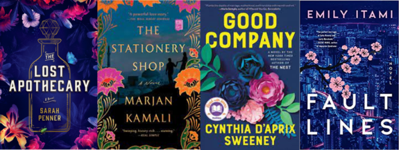
2. Jewel Tones
Another effect that can be seen layered with the bold fonts are jewel-toned colors. See how the rich patina of purple, blue, and magenta hues is paired with a high contrast font color to allow the titles to visually pop? These particular examples contain floral elements, which also played a big role in the cover of my novel, Goodbye, Orchid.
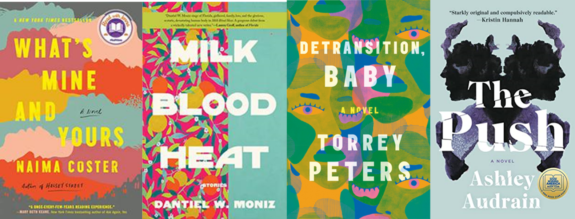
3. Abstract
In addition to the use of clean, bold fonts, another trend that can add distinctiveness is an abstract art background. This use of shapes and colors in unique combinations can create a one-of-a-kind look. At first glance, these designs may appear to be pure abstraction. However, as the cover draws you in, the reader starts to observe recognizable objects within the subtle images. For instance, notice the human eye shape in Detransition, Baby, and facial profiles in the Rorshach-like inkblot in The Push. These details add visual interest that can lead the reader to continue to study the design.
Geometric abstraction
A sub-style of abstract designs are covers that use geometric, or hard-edged, shapes. Here are some examples:
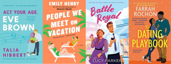
4. Illustrated vs. Realistic vs. Graphical
When it comes to depicting people or objects on covers, there’s a decision point between illustrated, realistic or graphics images. Romance, in particular, has increasingly animated its characters (see Talia Hibbert, Emily Henry, Lucy Parker, and Farrah Rochon’s cover examples).
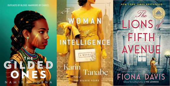
Compare that generally lighter tone with the gravitas of the more realistic images from Namina Forma, Karin Tanabe and Fiona Davis’ books below.
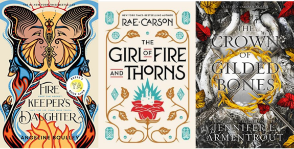
Another treatment can be highly designed, ornate graphics.
Review all the styles we’ve studied so far. What emotions do each evoke? How do they differ from one another?
5. Special Topics: Monochrome, Retro
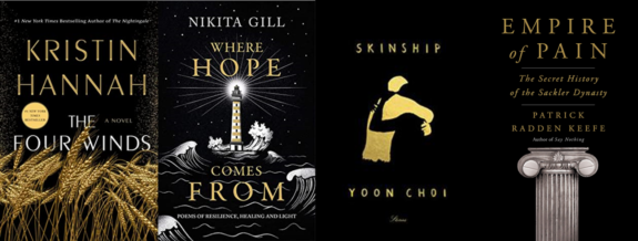
There are, of course, many more style routes that designers can choose. Let’s contemplate two final trends. First, a monochrome background with a contrasting color can be visually arresting. The below black-hued covers create an understated, somber tone. The generous use of negative (empty) space contributes to a feeling of gravitas.
Monochrome can be another way to deliver the simplicity we discussed earlier. In these examples, the simple black and gold combination can effectively break-through in a sea of color:
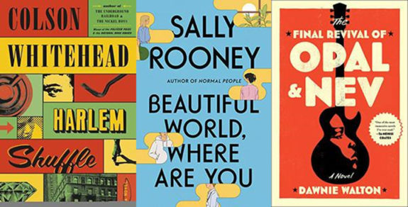
One final special trend is the use of retro covers and fonts. These can be chosen deliberately to convey a certain feel to readers. For instance, Harlem Shuffle is set in the 1960’s, and The Final Revival of Opal & Nev takes place in the 1970’s, making the old-timey colors, fonts and images consistent with the stories’ setting. How do these make you feel versus the other types of covers?
I hope you’ve enjoyed this look through these book cover trends, spanning simple yet evocative, jewel tones, and abstract covers; the comparison of illustrated vs. realistic vs. graphical covers; and a peek into some special trends, including monochrome and retro covers.
Remember, none of these book cover trends are “right” or “wrong.” Book cover assessment is more about the fit of the cover to convey the book’s promise to the reader, and as with all art, is highly subjective!
Tell us in the comments: What are your favorite book cover trends from 2021?
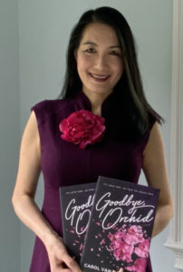
Carol Van Den Hende is the award-winning author of Goodbye, Orchid, a public speaker, and MBA with 20+ years’ experience in marketing, strategy and insights.. Carol is passionate about simplifying marketing concepts into actionable steps that authors need for publishing success. Please sign up for Carol’s newsletter at https://carolvandenhende.com/contact or linktr.ee/cvdh


