
Thanks for sticking with me! We’ve already talked about creating a professional book package for fantasy and romance books, but we’re not done yet. Continuing on our genre cover journey, let’s dive right in:
Science Fiction
This genre includes several subsets for the purposes of cover design: “hard” and “soft” science, space opera, steampunk and dystopian.
In a hard science fiction the entire plot revolves around technical scientific details, rather than people (though obviously people, or aliens, are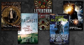 present). The cover promises the reader that the technical details of science are paramount. Covers for this type of story will reflect that with scenes featuring stars, planets, or alien looking environments or people. They often include throw-back headline fonts. Deep space colors (black, dark blues, dark orange or red) will be prominent. Titles are large, in your face, often outlined. Older covers featured drawn artwork, but these days photography is more prominent (probably for practical reasons as space photos were hard to come by in the olden days). Author names read clear and easily from a distance. The intended audience is male. unk, and dystopian being the main ones.
In “soft” science fiction, including space opera, the people (even if they’re aliens) and relationships take precedence over the science. “Soft” science fiction covers often have a lot in common with urban fantasy, in that a person (often female, not necessarily human) may be featured on the cover, but mixed with futuristic looking backgrounds rather than misty magical ones. Titles usually feature more classic, timeless fonts. Like urban fantasy, the author name is usually larger.
Dystopian stories fit here as well, and since they feature a cataclysmic decline in society in some way, often set in the future, the cover will reflect that. But the basic elements will still fit the speculative fiction rules. Maybe the buildings are crumbling, or the planet is exploding, but in general the overall tone is similar.
Steampunk is a new sub-genre, and unique in the combination of history and science fiction. The addition of these types of stories is why many prefer the term “speculative fiction” these days, rather than science fiction. Generally speaking, steampunk features steam powered machinery, in settings inspired by 19th Century civilizations. Gears and clockworks feature prominently in these stories, and on the covers. No other genre looks like this – a combination of Victorian era clothing and gears. Colors are rich earth tones, dark blues, smokey grays, and sepia tones, all of which tells the reader this story is set in historical times. The gears and clockwork point to the science element. Whether the story is romantic at the core or mystery/thriller, the story is best served with a cover that reflects steampunk gears over anything else. The intended audience depends on the core story, and rules for other genres would apply here. Romance? A girl or couple on the cover. Mystery? A shadowy figure or shady background, etc. With gears.
Mystery
Mystery covers tend to split into two main subcategories: hard-core, or cozy. Cozy mysteries, for example Murder She Wrote, feature crime solving, but not a lot of blood or gore. Often with a dose of humor. Cozies sometimes feature artwork, rather than photography. They usually look fun, like a cartoon. Title fonts are whimsical, even the author name is fun. The promise here is a read that will NOT give you nightmares.
In contrast, a hard core mystery cover veers toward scenery, shadowy figures, dark colors. Maybe a dead body or a hint of blood, but more likely just a brooding scene. The promise? You’re going to find a dead body or two or three, and it might be decapitated, and for sure there’s going to be blood. And the mystery will involve things that are more intense or higher stakes. Titles are often more subdued. Author name is quite prominent and easily read, a focal point. More important than the artwork OR the title.
The intended audience is a bit murky with these covers. While cozy mysteries in general aim for a female audience, hard core mysteries attempt to attract male and female readers equally, which is one reason for shadows and scenes rather than depicting the lead character.
Thriller
Thrillers are more intense than mysteries, and the cover should reflect that. Like all main genres, there are sub sets to consider. Legal, psychological, political – all will feature a slightly different background. All of them, however, generally feature photography over artwork,
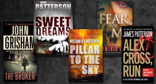
and a sense of urgency. Usually if a person is pictured at all, they’re in shadow. Is it modern? A truck running down a shadow figure on the road will tell us that. Is it a historical thriller? Then I’d expect some old fashioned looking buildings or street signs or something to place me in the time period, along with blood or a dead body. Even the type helps sell the urgency by being large and in your face, maybe broken, disjointed, or some other font that screams high stakes and lots of action. The intended audience is slightly more male than female.
Horror
Take mystery and thriller covers and make them darker, with spooky looking fonts, and you have a horror. Horror is, after all, those things, 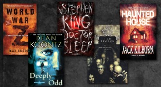 intensified. There might be a ghost or other supernatural creature, but it’ll look mean. As with mysteries and thrillers any people shown will be shadowy rather than full faced, because what’s spookier than a shadowy figure chasing you down the highway? The promise? You’ll definitely have nightmares. Especially if it’s a psychological horror. That blood? It might just be yours . . .
Photography is featured prominently unless the story is historical in nature. The intended audience is a bit tricky and will depend on the story. If a couple is facing horror together, or romance is involved, then romance genre rules would apply, though with the addition of darker tones. If it’s more of a thriller, then the mystery/thriller rules would apply . . . again, with darker colors.
My next post will take a look at Literary and Women’s Lit, Humor, Children’s Lit, Young Adult, the conundrum of New Adult, and Non Fiction. If I haven’t specifically mentioned a genre you’re interested in, please leave a note in the comments and I’ll try to include it.
Until then, happy designing!
…………………………………………………………….
 Melinda VanLone serves as DIY MFA’s official shutterbug. Melinda earned an MA in publishing from Syracuse University, which she applied toward years as a graphic artist/designer, a skill she uses today at www.bookcovercorner.com.
In addition to book cover design and photography, Melinda writes urban fantasy and blogs on her website melindavan.com. As an air force brat, she’s lived briefly in places all across the country, but currently resides in Rockville, MD with her wonderfully supportive husband and furbaby. When she’s not playing with imaginary friends in her fantasy worlds you can find her playing World of Warcraft, wandering through the streets with her camera, or hovered over coffee in Starbucks.


