
Continuing where we left off, let’s take a look at those genre specific cliches that can help make your cover a success. Are these hard and fast professional book package rules? Of course not. But someone looking to hook as many readers as possible would do well to pay heed to their genre guidelines. At least know what they are before you jump off the deep end and break them.
By genre then, here’s the guidelines:
Fantasy – Epic/High/Heroic/Sword and Sorcery

These fantasies tend to use artwork, either digital or hand drawn/painted (unless you’re lucky enough to have a movie made from your epic). This sub genre is the least likely to use modern, unadorned, photography. The lead character (often a man) is often front and center, usually with a sword or a horse, and some fantastical scenery behind him. Or he might have a dragon lurking just over his shoulder, or perhaps he’s facing the dragon, sword drawn, ready for battle.
If it’s a more involved high fantasy epic with multiple main players, it might feature just scenery, or scenery with some sort of icon. Something significant in the story, like a throne. The author name is large, and the title often uses a font that screams “fantasy”, with decorative elements. The overall tone is sweeping, grand, and heroic. The colors are typically extremely saturated, deep and rich. Manly. The typical audience they try to attract is male (don’t shoot me ladies – yes I know women read these too…I’m one of them).
By using these elements, the cover alerts the reader that here is a tale that will take them to distant lands, that there will be good vs. evil, a hero, possibly a heroine, war on a grand scale, and some magic. Probably an evil warlock or king, and definitely some sort of dark fantasy creatures to tangle with. It’s what fantasy readers are looking for, and they’ll gobble up such a cover with glee.
Urban/Contemporary Fantasy

A relatively new genre, urban fantasy mixes magic with our modern world. The stories tend to feature a female protagonist (not always but most often), and she’s usually on the cover in front of rich backgrounds full of gravestones or magic swirls. It’s most often photography, or very detailed digital art. Very rarely is it painted, watercolor or anything hand drawn. Usually the photography is slick, the girl is wearing leather or denim, and she’s often holding a weapon.
The author name is medium to large, the title uses decorative type fonts. The overall tone is dark, moody, with a sense of that something evil lurks just out of sight (or perhaps right behind her). The colors tend toward rich blues, blacks, grays, greens. Earthy, deep colors. The typical audience is female. As with epic fantasy, if the protagonist is not featured, a sweeping scene, often with a symbol or other artistic element, is included, especially if the age range tends toward New Adult.
When a reader sees this type of cover, he knows this is a story set in our modern world with a kick-ass heroine they’d love to know and perhaps fight side-by-side with.
Paranormal Fantasy/Romance
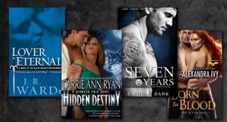
Paranormal fantasy/romance slips into the cracks between urban fantasy and romance, and thus will have elements of both on the cover. Here, too, photography is featured instead of drawn artwork. Often, there’s a couple, possibly nearly naked. Or a man with a bare chest, or one woman in a suggestive pose, just like any other romance. The difference is, in paranormal most often there’s also a magical element included, and possibly fangs. A graveyard, perhaps. Maybe smoke. Or fire. Deep gray, blue, or green tones. The title font is a bit cleaner, more classical than usual fantasy. The author name is often smaller, less noticeable, letting the artwork take precedence. The typical audience is female.
If those elements are not on the cover, the reader will pass on by. They’re looking for a love story and a fantasy escape, combined. If they don’t see it in the artwork they won’t believe it’s in the words.
Romance
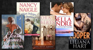
Ah, love. You’ve seen the covers. Cheesy. They make you cringe when you pick up the book. You might even hide the cover from your friends. So why are the covers like that? Always with a man with giant arms and attitude, and a girl in skimpy clothes? Sometimes they are kissing or laying on a beach. Cheeeeeesy. But it works. The reader looking for a romance will pause at a cover of a good looking couple embracing. She’ll pick it up because the promise is there in front of her. Here is a love story, dig in! It might look like cheese to you, but to the reader it’s exactly the escape she’s looking for.
There are splits between historical and contemporary, but the basics remain. Historical will tend toward drawn artwork, though photography is not out of the question. If photography is used, it’ll have an effect that makes it look old-timey. Contemporary often uses less artwork, more real people, and sometimes splits the cover with the couple on half of it, a scene on the other half, especially if it’s a Harlequin. You’ll know at a glance what kind of couple is featured in the story, and where the story takes place. Colors tend to be lighter, brighter, often those associated with weddings. Flowery (unless it’s tending toward steamy). Sometimes a scene is used rather than people, but that’s more of an exception. Author names tend to be smaller, though not always. The title often feels like an after thought. Fonts are classic, timeless, serif in general, often thin. Primary audience is female.
Romance takes one more thing into consideration that other genres don’t. The relative “heat” level of the story should be evident in the cover. If this is a “sweet” romance, where sex is not described, often fading to black, then the cover will tend toward innocent looks, fully clothed people. If this is a “steamy” romance, most likely bare bodies grace the cover. Erotica of course is one step further, and isn’t really romance at all. For erotica, it’s all about the sex, less about a relationship and emotions. Those covers don’t leave a lot to the imagination, though there are notable exceptions.
Next time, we’ll look at mystery, thriller, horror and sci fi.
 Melinda VanLone serves as DIY MFA’s official shutterbug. Melinda earned an MA in publishing from Syracuse University, which she applied toward years as a graphic artist/designer, a skill she uses today at www.bookcovercorner.com.
In addition to book cover design and photography, Melinda writes urban fantasy and blogs on her website melindavan.com. As an air force brat, she’s lived briefly in places all across the country, but currently resides in Rockville, MD with her wonderfully supportive husband and furbaby. When she’s not playing with imaginary friends in her fantasy worlds you can find her playing World of Warcraft, wandering through the streets with her camera, or hovered over coffee in Starbucks.
Email: melinda.van@gmail.com
Twitter: @melindavan


