
Have you noticed book covers stepping up their game? If so, you’re right! These trends make today’s annual book cover review extra exciting.
To provide some background, much of my professional life has been spent studying trends and foresight (I’ve also worked in marketing, strategy, competitive intelligence, digital, and more…stories for another time!)
At its surface, foresight might appear to be “reading the tea leaves,” the impossible job of predicting the future. But people don’t just identify the future, we create it. We as writers wield the power to spark newly imaginable possibilities. (For example, think of the aspects of science fiction that have come to pass). Hold that power with reverence! For me, my fiction aims to deepen hope and empathy.
Today, we’re turning our foresight toward the specific topic of book cover design!
First of all, I’m proud that last year’s roundup continues to be relevant.
My year-end 2021 themes included:
- Simple yet evocative covers that leverage bold colors and sans serif fonts to stand out in the digital environment of online bookshops
- Jewel tones that create a rich palette and contrasts
- Abstract covers that include geometrical abstraction
- Increased illustrated and graphical covers vs. realistic ones
Read the full article here
Looking forward to 2023, here are four big themes to consider. Let me know if you’ve noticed these trends as well…
My 2023 predictions:
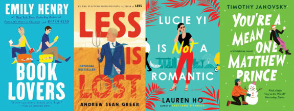
1. Animation Anytime.
Increasingly, covers are illustrated, with high pops of color and animated characters, which play well in online marketplaces where images need to break through as a small thumbnail image.
This look started primarily in romance, as it can effectively convey a breezy light-heartedness (see example covers Lucie Yi is Not a Romantic and You’re a Mean One, Matthew Prince). The cartoon-like look allows characters to be depicted generally, with broad suggestions for features. This can be helpful to allow the reader to fully imagine the characters.
Nowadays, Animation Anytime is beginning to transcend genres. See how the theme is completely effective on Pulitzer Prize winning author Andrew Sean Greer’s sequel, Less is Lost.
What’s next? This trend has potential for longevity, since it’s effective in our increasingly digital shopping marketplaces. My prediction is that the effect might migrate to more genres. For instance, imagine this look executed in darker, moodier color palettes to connote gravitas appropriate for more serious literature.
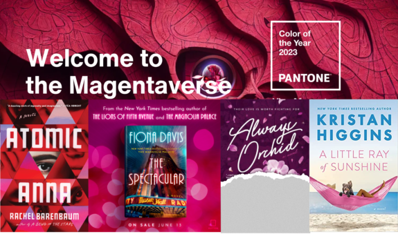
2. “Welcome to the Magentaverse”
The Pantone company is famous for defining the exact hues of all the colors that are used in packaging, ads, and design. In early December, they unveiled their annual color of the year. For 2023, it’s bright and bold Viva Magenta. This color embodies the joy that people are seeking, and works well in both physical and digital worlds.
Some book launches already illustrate this trend. For instance, take a look at the geometric shapes in hues of magenta on the cover of Atomic Anna. Fiona Davis’ 2023 novel, The Spectacular, lights up New York City’s iconic Radio City Music Hall in magenta, Kristan Higgins’ A Little Ray of Sunshine uses a pop of magenta, and designer Sarah Flood-Baumann had dressed my own novel, Always Orchid, in magenta well before Pantone’s announcement (the cover is partially concealed because the full design hasn’t yet been revealed).
What’s next? Some trend experts are predicting that people will be embracing fresh modern colors. Keep an eye out for futurists’ favorite hues like Digital Lavender.
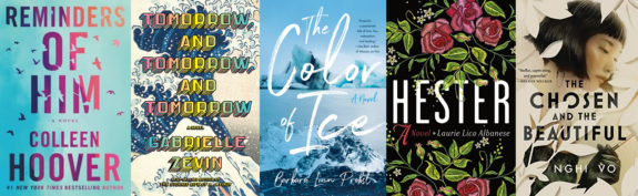
3. It’s All About the Title, No Extras.
One way to compete in a crowded digital marketplace with dozens of thumbnail images per screen is to shout your title. No shrinking violets here. The idea is to embed the book’s name into the reader’s mind. Sometimes, bold sans serif fonts accompany these looks that splash the title right down the full cover, like Reminders of Him or Tomorrow, Tomorrow, Tomorrow. In other cases, handwritten fonts provide a warmer, human feel to the cover design, like The Color of Ice. Non-fiction books have long employed this tactic, and now it’s making a splash in fiction!
What’s next? Placing title at the highest order of the communications certainly holds allure. I predict that designers will play at the edges of this approach. For instance, look for interwoven graphics that embellish the title, like the novels Hester and The Chosen and The Beautiful where leaves overlap with the simple sans serif lettering. This detailing can add some visual interest, cueing the book’s meaning while preserving the boldness of the font size. Authors who try this approach should make sure that the adornments don’t detract from the readability of the title – it needs to be legible even in a small thumbnail size.
4. Light it Up.
Although book covers are essentially static 2D images, cover designers use techniques to create dynamism (for instance, my debut novel Goodbye, Orchid used shattered orchids to connote motion). In this set of covers, designers have cleverly used the illusion of lights to “light up” the images.
Here are some more examples. Electric Idol shows a sparkly heart with bolts emitting from the center image to electrify the cover. Acts of Violet is dotted with circles of yellow to hint at stars. The Daydreams slaps electric green against a grayscale image to light up the cover as if it’s a marquee. Brilliant Carrie Soto is Back‘s cover bathes the protagonist in a shimmery gold light.
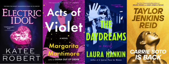
What to consider: When well-designed, the “Light it Up” trend can be a game changer. However, this technique can be hard to execute in printed covers. Metallic colors like silver, copper, and gold are particularly hard to print without special techniques like metallized inks (and their accompanying upcharges). Always test your cover design on print presses!
Please let me know which themes you’re seeing…And look for a future article from me on covers that display well on social media!

Carol Van Den Hende is the award-winning author of Goodbye, Orchid, a public speaker, and MBA with 20+ years’ experience in marketing, strategy and insights.. Carol is passionate about simplifying marketing concepts into actionable steps that authors need for publishing success. Please sign up for Carol’s newsletter at https://carolvandenhende.com/contact or linktr.ee/cvdh


