
Welcome back, poets! Today I thought I’d do something different and talk about one of my favorite things—book cover design!
If you’re planning on traditionally publishing a full-length poetry collection or chapbook, you will typically work with a designer and the publisher to come up with a book cover design you’re all happy with. While this means you don’t have to search for a designer yourself, it’s helpful to keep in mind the elements of good cover design—in other words, what will make your cover look polished and professional.
Good cover design is especially important for poets who are planning to self-publish their collections. If you’re going the DIY route with your book cover design, you’ll need to make sure you’re following best practices to create something eye-catching. If you’re hiring a designer, you’ll need to be able to find designers who specialize in your preferred style.
Read on to learn about some popular cover trends in the poetry genre and what makes these covers good starting points for your own publishing journey.
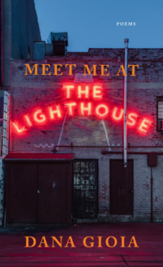
1. The Typography-Based Cover
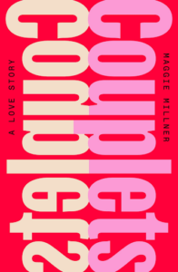
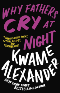

These covers typically center around typography—bold and colorful like Couplets and Why Fathers Cry at Night or classic and clean like the above alternate cover for Natalie Diaz’s Postcolonial Love Poem.
Typography-based poetry covers usually don’t have a lot of extra ornamentation on them, such as illustrations or photographs. Instead, the focus is completely on the typography: its layout, color, and font type (serif, sans serif, brush, handwriting, etc.).
Typography-based covers have been around for a while and I don’t see this trend going away any time soon—and for good reason! They can be simple or elaborate, depending on the tone of your collection and they also don’t require purchasing or doing a lengthy search for good stock photos, illustrations, or other art, as—again—the typography is the sole focus.
This style is especially beneficial for poets who will be self-publishing or presses with a tight budget, as the designer or DIY-er won’t have to worry about any heavy photo manipulation. It’s all about the font!
2. The Photo-Based Cover
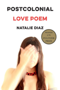
These covers revolve around a central photograph, sometimes a self-portrait as Natalie Diaz did with the cover for Postcolonial Love Poem.
While photo-based covers can be a bit more challenging to DIY—for example, you need to make sure all photos you use are properly licensed for use on book covers—if you find a striking image that fits the theme of your collection, it can do wonders to add interest to your cover.
3. The Object-Based Cover
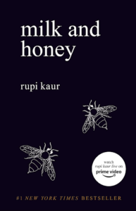
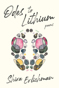

Like the description suggests, these covers revolve around a central object or objects without much extra ornamentation.
Oftentimes object-based covers are paired with interesting typography to add extra “oomph,” such as the cover for Odes to Lithium. The handwritten brush font and the illustrated objects on the cover work to compliment the confessional-style poetry within the collection. In other words, the tone of the collection is clearly conveyed by the stylistic choices of the book cover design.
Milk and Honey is another classic object-based cover (technically, bees aren’t an object, but you get my point) and I’m sure many of you have seen this one out and about online! Again, the cover is simple, featuring two hand-drawn bees and a simple, non-ornamental font. The cover reflects Kaur’s writing style perfectly: short, simple, sweet.
I would argue that object-based covers don’t pose the same challenges as photo-based ones, however, when searching for potential illustrations to use (if you’re DIYing the cover), make sure you have permission to use the images. If you’re working with an illustrator or designer, it’s always helpful to provide samples of illustrations that you like and want to see emulated on your cover.
4. The Art Cover
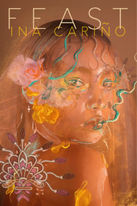

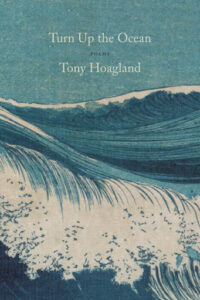
Last (but certainly not least!) is the art cover, which holds a special place in my cover-obsessed heart.
Art-based covers focus just on that—art. They can include custom-painted covers or artwork from the public domain.
These covers often have a more painterly and literary look to them, so if you write poetry in a more traditional style or form, you might consider an art-based cover. Poetry that tends to be lush and lyrical are also good candidates for an art-focused cover. I’ve seen many nature poets also use art-based covers, though that’s not a hard and fast design rule (for example, poet Mary Oliver has stunning photo-based covers!).
Back to you poets! What are some of your favorite poetry covers? Is there a book cover design trend you’ve seen that I haven’t discussed here? Let me know in the comments!

Manuela Williams is a Las Vegas-based writer and editor. She is the author of Ghost In Girl Costume, which won the 2017 Hard To Swallow Chapbook Contest. Her second poetry chapbook, Witch, is forthcoming from Dancing Girl Press. When she’s not writing, Manuela is busy drinking coffee and spending time with her blind Pomeranian, Redford.


