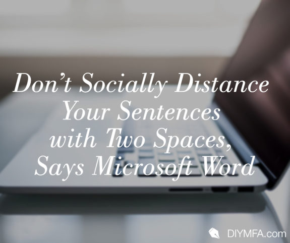
Microsoft Word has officially drawn a line in the sand—a squiggly red one, that is. And depending on your typing training (and how recently you’ve updated your software), you may have started seeing a lot more of those squiggly lines pop up recently. That’s because Microsoft Word is now flagging two spaces after a sentence as an error.
Whoa! That’s Big.
I know, right? Like the Oxford comma, sentence spacing is another hotly debated topic that has managed to hold supporters on both sides for decades. And with everyone from Smithsonian Magazine to your local newspaper reporting on this change, Microsoft is certainly feeling the heat from their decision.
To be fair, many style guides (e.g. AP, US Gov Printing) made this same declaration years ago. But AP doesn’t have a grammar checker used by an estimated 1 billion people worldwide. So, what urged one of the biggest word processing systems to make such a drastic decision? Well, frankly, it was about time.
Early Technology
The concept of a typewriter was first imagined way back in the 1700s by Englishman Henry Mill whose patent was for “an artificial machine or method for the impressing or transcribing of letters singly or progressively one after another.” Over the next few centuries, advances in technology resulted in the standardization of the typewriter into the Underwood style of 1895.
These typewriters used monospaced type. In a monospace typeface, each character occupies the same width on the page, which can be tricky to the eye. Therefore, to help readers clearly separate sentences in typed documents, two spaces were used after every sentence.
Computer Processing
From the 1930s to the early 1980s, typewriters were used in high schools and grade schools across America to teach general typing skills. (Thus, why anyone in school during that era probably uses two spaces after sentences.) But with the first PC from IBM in 1981 and the first Microsoft Word program in 1983, typing went from a fun resumé filler to an absolute necessity. And it was during this time that variable-width fonts were finally introduced.
A variable-width font is one in which each letter is spaced and sized proportionally to the letters next to it. Most people find this style of type easier to read which is why the majority of fonts available and used today are variable-width fonts. The other advantage to a variable-width font is that sentences look more clearly defined, eliminating the need to place two spaces after terminal punctuation.
Hard Habits to Break
While two spaces after a period, question mark, or exclamation point may be unnecessary by today’s standards, that doesn’t mean it’s an easy habit to break. In fact, Microsoft’s Director of Program Management, Kirk Gregersen, recommends that those who disagree with the rule simply turn off that particular setting.
As an editor, I vastly prefer a single space, to the point that I complete a “find all” on any manuscript sent to me and replace all double-spaces with a single. But as with all editing, it’s a preference. The best way to “get it right” is to simply ask who you’re working with (i.e. an editor, agent, publisher, etc.) what their style guide prefers.
If you’re currently a double-spacer, it’s your choice—change your Word settings or change your typing habit. If you’re a single-spacer—congrats, your team scored a big win. At the end of the day, this editor is happy.

Jeanette the Writer is an editor, coach, and freelance writer who wants to help others demolish their editing fears and finish their manuscript. As a former scuba instructor turned entrepreneur, Jeanette knows about putting in the hard work to pursue your passions. She has worked with authors, speakers, coaches, and entrepreneurs—empowering them with the right mindset, knowledge, and tools to help them tackle their editing goals. You can learn more about Jeanette by visiting JeanetteTheWriter.com.


