As you might have noticed, I’m really into design. A graphic designer and product manager in a past life, you could say I’m a little bit obsessed with clean lines and balanced designs. I love problem-solving so that form and function work together seamlessly. One of the areas that most fascinates me in design is color theory and color symbolism. I find it remarkable that certain colors seem almost to have certain personalities or identities. Much like characters in a story.
Colors and Their Meanings:
Certain colors have intrinsic meaning.
Red means “stop” or “and orange is an attention-grabbing color so it’s often used for warnings. Green suggests growth and life, and blue generally has a calming influence. Even before we add the layers of other influences, these colors already have a certain symbolism inherent in the color itself.Traditions and cultures help shape symbolism.In Western culture, the color white implies innocence and purity while in other cultures it is actually the color of mourning. The phrase “green with envy” has added a different layer of meaning to the color.
Combining colors lends nuance.
Blue alone might symbolize peace and calm, but add red and yellow, and you get the primary colors which imply youth. Replace the yellow with white and you get a patriotic color combination. When you pair colors together, their meanings can change or acquire nuance.
Introduction to Color Theory:
Red, Yellow and Blue are the primary colors.
They are called primary colors because you cannot mix any other colors together to get these three.
Note: red, yellow and blue are primary colors for pigment. When you’re talking about color and light, the primaries are actually red, green and blue but that gets us into the differences between the color of light and the color of pigment and that’s the subject of another post.
Orange, Green and Purple are secondary colors.
They are called secondary because you can make them by mixing only two primaries.
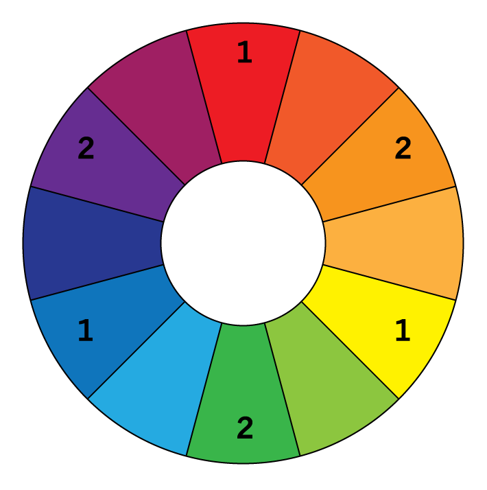
See the color wheel below for primary and secondary colors. Primaries are marked with a 1 and secondaries are marked with a 2.

Colors that are opposite each other on the color wheel are complementary colors.
These colors complement each other well and provide contrast. Each of the primary colors has a secondary color as its complement.
But, what does this have to do with writing?
How I use color:
When I develop a new character with a rough biography, I staple or glue a paint chip to the bio. The color becomes like a wordless bio for the character, telling me almost as much as the written details.Try This:
Field trip! Next weekend, take a half hour and go to a hardware store to browse the paint aisle. Most stores give out free paint chip samples so grab a few. No wait, grab a bunch. Try to find the perfect paint color to represent your character or your story. If you’re really ambitious, pick out colors for each of your important characters. See where the contrasts are, as well as the harmonious combinations.If you’re really really ambitious, skip the paint store and browse a fabric store instead (where you can play with color as well as pattern and texture). If you don’t have time to browse the stores, break out the markers, colored pencils or better yet, paints. Mix and match and play with color. The point here is to have fun and to use colors to capture the essence of your story.


