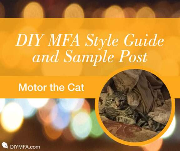

The purpose of this private sample post / style guide is to give us an accurate view of how DIY MFA website styling looks “in action” in a typical post. Image is a place-holder, as is subsequent paragraph text.
The purpose of this text is to show you that we generally prefer to have an introductory paragraph that is long enough to wrap around the featured image to the right of the text. That helps with spacing and is also more aesthetically pleasing. Note that the featured image will push the text into a narrow column.
That said, long blocks of text are hard to read, so keep your paragraphs short, as in the length of what you’ve been reading. In general, shoot for 3-5 lines long. But you can also use single-line paragraphs to really drive home a point. While longer blocks of text will work for print media, on a computer screen or mobile device, we’re used to reading or skimming shorter blocks of text. To that end, this paragraph is around that ideal length. By keeping your paragraphs short, you help to engage your readers.
That’s all I have to say about that. The rest of this is making me think of the subtitles at the beginning of Monty Python and the Holy Grail. Wik. Also wik. I really hope someone besides me has seen that movie and knows what I mean. Also, I hope, like the people making the movie subtitles, I don’t get sacked as web editor for making this bit of text interesting to read.
Now let’s get to the nitty gritty…
Types of Articles
At DIY MFA, we publish two types of articles: editorials and our list post, #5onFri.
- Editorials, including Thursday Guest Posts. These are a freeform style and relate to one of the three DIY MFA tenets: reading, writing, or community. Within those confines, posts can focus on any subject, including but not limited to:
- Recommendations. These suggest further reading, viewing, or listening. We avoid reviews.
- Craft. From three act structure to how to read like a writer, and anything in between.
- Genre specific material. Tropes and themes, meet cutes, and action scenes.
- The business of writing. Marketing, self-publishing, how to get an agent, and what your first book launch looked like.
As you can see from the above examples, there are a multitude of possibilities. All that we ask is that you avoid the number five. We reserve that for our Friday posts.
Columnists are welcome to pitch Thursday guest post topics if they want to post about something outside of their regular columns.
- #5onFri. These are our list posts, and follow the same constraints as our editorials, with one important difference.
- All posts feature five distinct points. For example, if you are writing an article about the five act structure, each act would be its own delineated section. Or you could make five reading recommendations. Please note, this is the only post in which we feature the number five.
Also, these are typically guest posts. However, columnists are welcome to pitch #5onFri topics if they want to post about something outside of their regular columns.
Repeat Submissions
If you’ve gotten an article published with us, we’d love to work with you again! Seriously, send Lori your pitches! You can reach her at lori[at]diymfa.com
Your Article is Written and You’ve Submitted, Now What?
First off, pat yourself on the back! The heavy lifting is done. Long story short, sit back and let us handle the rest. If we have any questions, we’ll be in touch. That said here is an important caveat:
Once you’ve submitted your article, it’s just that—submitted. If your due date has passed, NO FURTHER CHANGES CAN BE MADE TO THE ARTICLE WITHOUT PRIOR APPROVAL. The due date is scheduled specifically to give our staff enough time to get it ready for publication. If you spot an issue, shoot us an email and we’ll do our best to accommodate, but be aware that in some instances, it just isn’t possible.
As with any publication, it’s the author’s responsibility to submit a polished piece, and we treat it as such. Edits that result in having to reformat and copyedit entire articles are both a disservice to the author and our staff.
If you notice a factual error after your post has gone live, let us know and we will correct it. Other issues, such as stylistic grammar choices, cannot be addressed after an article has gone live. Each article has been checked by both a human and an AI copyeditor. The grammar has passed muster.
Late Submissions
We get it, sometimes life happens and you can’t meet a deadline. In the event you’re unable to meet your due date, we would appreciate as much advance notice as possible. We can usually work with you to make it work. For columnists, chronically missing deadlines will be taken into account when planning the roster for the next year. More info on this can be found in the Columnist Agreement
Please note that in most cases, it’s one of our staff that steps up to the plate to pinch hit, effectively tossing a hot potato in their lap.
SEO
SEO is the acronym for Search Engine Optimization. It’s what’s going to get your article read when people type a question into Google. Historically, DIY MFA has taken care of this entirely in-house, but there’s no reason why you as an author shouldn’t take advantage of it and craft your article to perform at its very best.
Although there’s no way we can give a complete primer on SEO, here are some things for you to keep in mind in regards to your submission:
Every Article is Assigned a Keyword or Words.
- This should be short and sweet.
- It should encompass the overall theme of your article.
- The keyword(s) needs to be repeated throughout your article. Ideally, six or more times for a piece of 1,200 words.
- The preferred placement for keywords is in the title, first paragraph, and headers, plus a few sprinklings in the body text.
Most of the changes to articles that occur are to optimize SEO. The closer you can stick to the above guidelines, the less likely your text will be altered.
Grammar and Word Count
Articles should range 800-1,200 words. Any less and SEO doesn’t like it; any more and you post won’t get read.
DIY MFA publishes exclusively in American English spelling and grammar. This includes:
- Double quotation marks. “…”
- No “u” in words like “color” and “honor.” The use of “z” instead of “s” in words like “characterize” and “analyze.”
- Book titles should be verified for accuracy and then put in italic font.
- Em dashes (called this because — is the width of the capital letter M) to signify an extended break in prose, i.e. text being suddenly cut off, or a pause longer than a period. There should be NO space between it and text. While fun, these should not be used gratuitously. Frequently, em dashes wind up getting converted to two separate sentences.
- En dashes (called this because – is the width of the capital letter N) are used exclusively for hyphenation purposes and will be ruthlessly eliminated if spotted outside of their natural habitat.
- Punctuation inside of quotation marks. “This is a quote.”
- Use an Oxford comma or else.
- Plural possessives end in ’s. (ex. horses in the possessive form is horses’s.)
- Professional titles, honorifics, and other abbreviations are punctuated.
Industry Specific Terms
We get it. The spelling of industry specific terms can sometimes be difficult to pin down. Case in point; world building… or is it worldbuilding? No… maybe world-building…?
Never fear and stop scrolling through google. At DIY MFA, it’s world building, and here’s a handy list of some other commonly used, easily confused, industry terms as per our house style.
- World building
- Copywriting, copyediting, etc.
- Read through
- There’s about a billion more, and we’ll update this blog post as we come across them.
On to Formatting, Specifically, Headers.
As with short paragraphs, headings and subheadings help break up the text and re-engage your reader’s eye. They also provide valuable clues as to where they can find the information they wanted when they clicked on the article in the first place. Additionally:
- Do NOT use ALL CAPS in headers. WordPress will throw a tantrum and it won’t be pretty.
- DO specify if you want a particular header to be H3 or H4. If you don’t specify, don’t worry. We’ll format it for you, but know that our default is H3 for section headings, and H4 for sub-headings.
- Headers are typically written in sentence form, or in title format. Title format means that all words are capitalized EXCEPT for articles and prepositions. (Hah! And you thought that list your 7th grade teacher made you memorize was a waste of time.)
This is an H1 Header.
We use the H1 header in the title of the post. That is the only text that gets the H1 header. Please avoid using all caps in your titles. Granted, this is sometimes necessary for acronyms, but generally avoid it.
Also, if you mention the title of a book in the title, you do not need to italicize it. Our default font automatically italicizes H1 and H3 text.
This is an H2 Header.
We don’t use this header any longer in blog posts. Please do not use this type of header.
This is an H3 Header.
This is the main kind of subheading that we use within our blog posts. It is smaller than Title (H1), but uses the same Bodoni Italic font, giving it a more delicate look that stands out more than the H4s. When in doubt, make it an H3 header.
With the H3, please do not bold the text. This distorts the font. Please avoid using all caps with the H3 header and try to keep them short. H3 headers look weird if they are too long, i.e. more than a line long. In that instance, switch to an H4 header.
You can use the H4 header below an H3 section or as the anchor to a list. This type of header can be bolded or not. H4 header can also be used at the end of an article when you want to include a call to action. For example:
Call to action. (H4 Header, centered.)
Variations of the H4 Header include:
This is an H4 header in bold.
This is an H4 header in italics.
This is an H4 header in bold and italics.
Normal paragraph text is in 11pt Arial font, single spaced. It should be specified for the bulk of your article. Variations include:
Bold paragraph text looks like this.
Italics paragraph text looks like this.
Bold italics paragraph text looks like this.
Lists
We’ve already discussed the reasoning behind and effectiveness of short paragraphs, which brings us to lists and bullet points.
Lists Should Look Like This:
- Ordered list item. This is the type of list to use in a regular post where you need to list things. You do not use this type of list in a #5onFri (Five on Friday) post.
- Ordered list item. Notice how the main point is bold, but the explanatory text is not.
- Ordered list item. Also notice how it is a numeral and a period. We do not use the pound sign # or closing parenthesis ) in lists.
- Ordered list item. I can’t think of anything useful to say here, so pretend it says something profound.
Bullet Points (Unordered Lists) Should Look Like This:
Please do not use any symbol other than a filled in rounded icon shown below.
- Bullet Point 1. Sometimes bullet points are more useful than a numbered list.
- Bullet Point 2. Notice again how the main point is in bold, but the explanatory text is not.
- Bullet Point 3. Again, I have nothing else to add here.
It is also a good rule of thumb to keep things sequential. If you are giving a timeline of events, keep them in order to prevent confusing your reader.
Quotes
Quotes can be an important part of your article, however, due to copyright infringement and other legal niceties, we are unable to publish more than a sentence or two of any given work. In the event more is needed to flesh out your article, it is recommended that you Link to the work in question.
Block Quotes
Like we said, you can definitely quote outside material in your articles. And you can do so within the normal text. But sometimes, that’s not enough, so you need a block quote. Below you’ll see how block quotes appear on the website.
This is an amazingly inspired block quote designed to inspire readers. Amazingly. And with lots and lots of amazingness.
—Anonymous
This is an amazingly inspired block quote designed to inspire readers. Amazingly. And with bold, italic, and bold italic text.
—Anonymous
If you want a quote to stand out, make a note of it and we’ll format it for you.
OK, so that about wraps it up for our style guide. Take-home message: keep paragraphs short, remember the featured image will affect the paragraph length at the beginning of the article. If you want a specific header type, let us know. Otherwise, keep in mind we’ll be using H3 and H4 headers.
If you have any questions not covered by this guide, please email Lori at lori[at]diymfa.com and she will get back to you with a definitive answer.
And Finally, the Bio
Your bio should be 1-3 short paragraphs written in the third person. A sample of what we mean is shown below. Please include any social media links you would like to share and a snazzy photo.
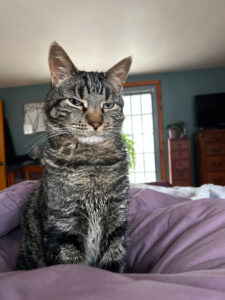
Motor T. Cat is a surly beast that spends most of his time napping when not instructing others on style. He finds mousing beneath him and prefers to befriend rodents.
His hobbies include decimating house plants, attacking small children, and biting unsuspecting visitors. He has no formal education, literary contributions, or redeeming qualities in general, but if he did, he would list them here, along with any other noteworthy accomplishments.
When not being a menace by walking directly in front of the tall food dispenser in his employ, he’s plotting his next unwelcome surprise. Chances are that will be discovered by a bare foot in the dark and squelch.
If he had thumbs, you could find him on his website, or follow him on Facebook, Instagram, and Twitter.


